Last week, I wrote about the massive amount of information contained in our RAW files. The histogram allows you to be sure that you’re capturing as much of that tonal and color information as possible. While all of that RAW data allows for a considerable amount of post-processing without degrading your image file, getting the best exposure possible in camera is going to result in a better final image with less time at the computer. And you’ll be more satisfied with your effort when you nail your exposure in the field.
The histogram is a big help in this regard. While many photographers don’t understand histograms very well, they are actually pretty easy to grasp.
Histograms are a type of graph used in statistics to represent the frequency and distribution of data according to some criteria. Those data could be related to absolutely any phenomenon we might imagine, like super complex and important scientific or economic research or more mundane questions. Want a visual representation of how many takeout pizzas people order according to the different days of the week? A histogram of pizza data would probably show big spikes on Friday and Saturday.
There are two kinds of histograms that our cameras can display — luminance and RGB. The luminance histogram is built on a horizontal or x-axis that represents the total possible range of brightness values in a given image from pure black (on the left) to pure white (on the right). The vertical or y-axis represents the number of pixels in your image that are black or white or any one of the many shades of gray in between.
You’ll also see color or RGB (red, green, blue) histograms available to view in your camera. This type of graph will show how many pixels in your image have red, green, or blue tones and whether you are oversaturating any of the colors (thereby potentially losing detail). The consensus among my professional nature photographer friends, however, is that the RGB histogram is of little use for our daily shooting. The only time I might think to check the RGB histogram is if I’m concerned about the red channel in a scarlet macaw or maybe the blues in a hummingbird like the violet sabrewing.
That said, I honestly can’t recall the last time I consulted an RGB histogram. I have always had my cameras set to display only the luminance histogram. If you use the RGB histogram in your own photography, that’s great. It’s not my way or the highway, but I do think that understanding the luminance histogram is more important to getting consistently good exposures in camera.

So, with regard to luminance histograms, we often hear that a classic bell curve (or symmetrical distribution in statistical speak) is a “good” histogram. While that is often not true, there are many images for which a bell curve will indeed be a good histogram.
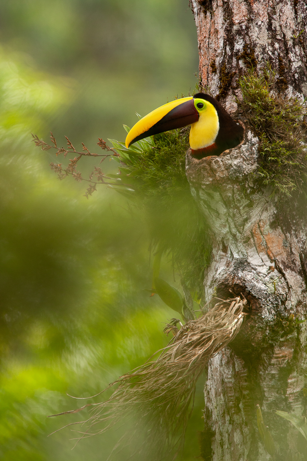
In this histogram for the above photo of a nesting yellow-throated toucan (Ramphastos ambiguus), for instance, you can see that the majority of the luminance or brightness values are clustered in the center of the x-axis. This makes sense because there are a lot of middle-toned greens and earth tones in the image. At the tails of the graph (the left and right edges), there are many fewer pixels with extreme dark or light values. And the values stop just before the left and right edges of the histogram, meaning that I have maintained detail in the darkest and brightest parts of the image.

 As the emerald glass frog (Espadarana prosoblepon) image above illustrates, however, the bell curve is not the only “good” histogram. The correct or optimum histogram will vary depending on the image. Glass frogs are nocturnal, so the black background, in addition to being graphically pleasing for this image, is perfectly natural. It gives a very different histogram than the more classic toucan image above but one that is absolutely correct for this photo.
Note that there is a big spike pushed up against the left side of the histogram. This means there are quite a lot of pure-black, woefully underexposed areas. I wanted the background to be black, and so it is. You’ll also notice that there are varying luminance values represented by the dark greens and lighter greens in the image but that, importantly, there are no pixels at the right edge of the histogram. Again, this is fine for this image as there are no values that are white or even close to it.
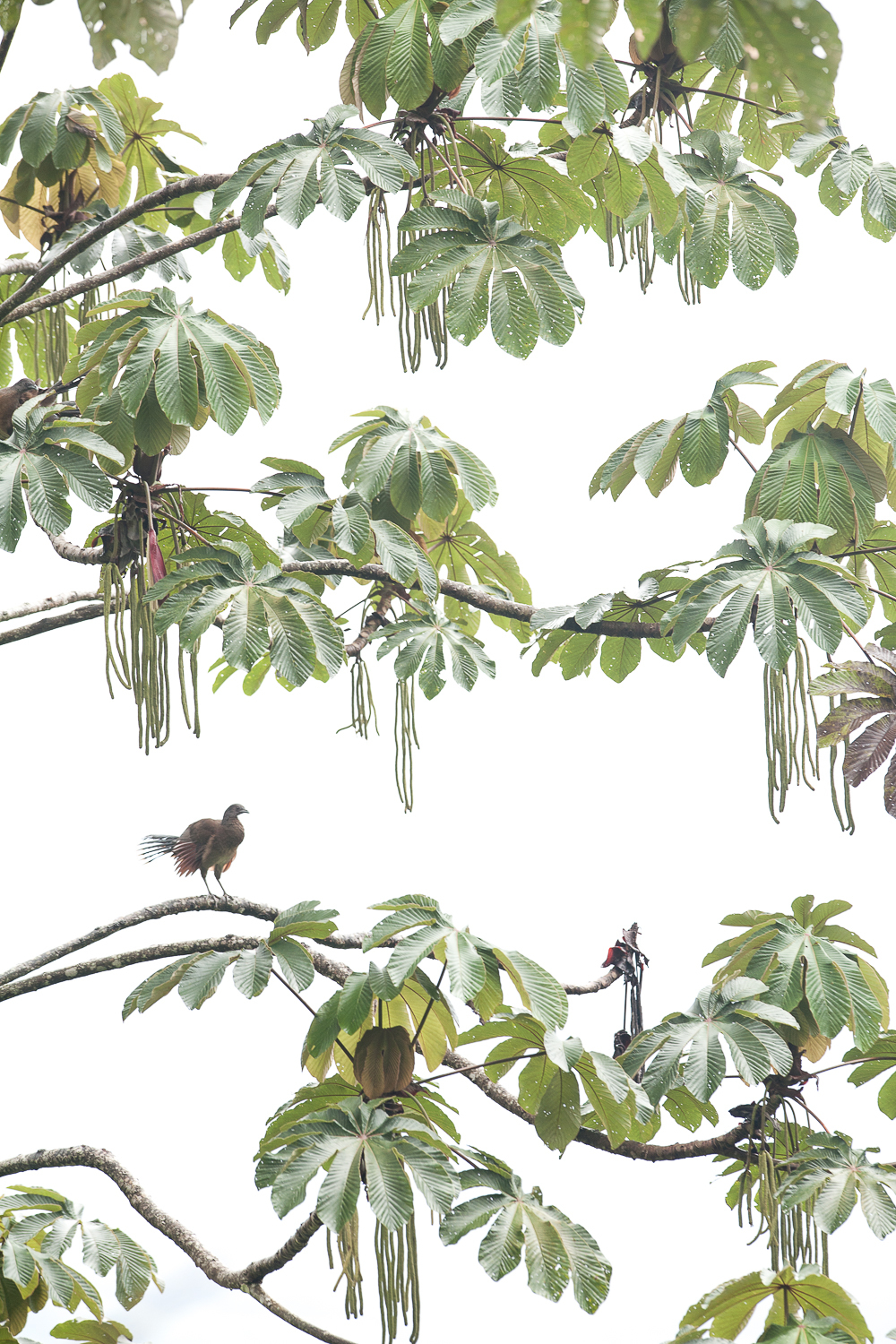
 Finally, let’s take a look at another example of a non-traditional histogram. The above photo shows a gray-headed chachalaca (Ortalis cinereiceps) perched in a cecropia tree in a rainforest in Costa Rica. Note that there is a big spike that bumps up against the right edge of the histogram. This means there are lots of overexposed highlights; in fact, a spike this big and this close to the edge means that these values are pure white and contain no recoverable detail. I exposed this way in order to reveal detail in the bird and leaves and enhance the graphic quality of the scene. This has turned out to be one of my most popular images, and no one has ever complained about the lack of a bell-curve histogram!
